How much your company pays for using VMware Aria Operations for Applications (formerly known as Tanzu Observability by Wavefront) depends on PPS (points per second) consumption. What you pay is based on data throughput, primarily:
- Data ingestion. When the Operations for Applications service ingests data, those data count toward your PPS allocation.
- Data analysis. When you run a query, either as part of an alert or when you look at a dashboard, the backend has to process the data, and those data points count toward your PPS allocation.
This page helps you get value from your PPS and avoid overage. Overage is an extra fee that customers with certain contracts pay if they consume more data than they paid for.
Where Do I Start?
Each customer has a contract with VMware that allows them to send a predetermined amount of data, measured in points per second (PPS), to their Operations for Applications instance.
If the customer uses more than the contracted rate, VMware bills for those additional data. Because VMware has to pay the cloud provider for data consumed by each Operations for Applications instance, we have to ensure that customers pay for the data they consume. But we want for you to get the largest amount of useful information possible from your data. This page has some tips.
How Do I Find Usage Information?
Your Operations for Applications instance includes out-of-the-box dashboards and charts that help you determine how close you are to your contracted rate and allow you to explore remediation options.
If you want to know how close you are to exceeding your committed rate and whether you will be billed for overage, you can use the Usage Summary dashboard.
|
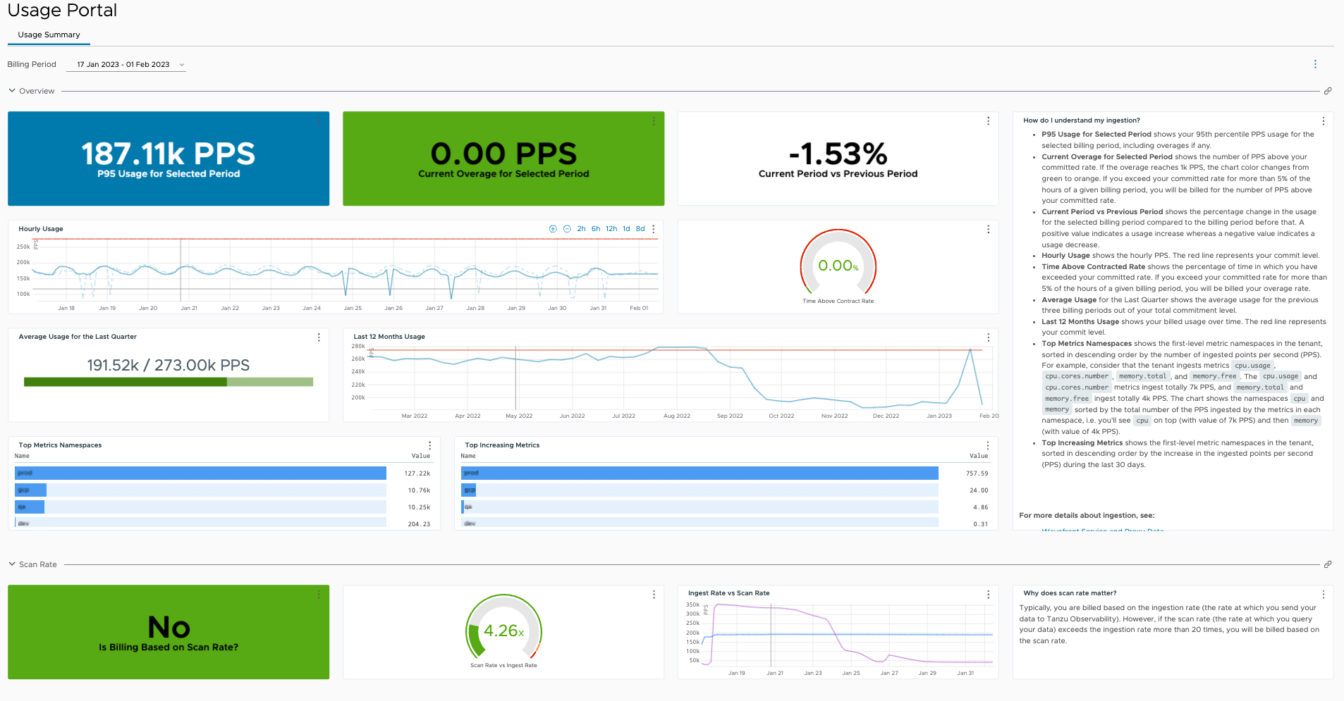 |
If you want to drill down into usage and pricing information, you can examine the dashboards in the Operations for Applications Usage integration. Your contract with VMware determines which dashboard has the information you need:
|
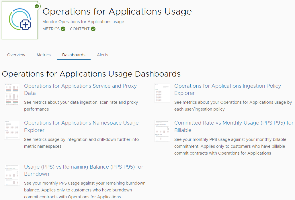 |
How Can I Make Improvements?
You can find information and improve PPS in several ways. The following table gives a summary.
| Action Item | Description | More Info |
|---|---|---|
| Find areas with high PPS and take action. | If your Operations for Applications instance ingests high-cardinality data or if you scan a lot of data during query processing, you'll get high PPS usage. Query processing happens:
|
How can I optimize my ingestion rate?
How can I optimize my scan rate? |
| Ingest only data that you use. | Datapoints that are sent in contribute to the PPS, so it makes sense to ingest only what's used, to reduce granularity, etc. It might also be necessary to find the teams who send data and don't use it. Ensure that someone benefits from all data that's sent in. | How can I optimize my ingestion rate? Who's Responsible for Ingested Data? |
| Remedy high PPS. | To remedy high PPS consumption, you can optimize the ingestion rate and the data shape.
|
Optimizing the Data Shape to Improve Performance Optimize Query Performance Ensure Optimal Dashboard Performance |
| Find teams with high PPS. | If several teams use the Operations for Applications service, explore which team sends in most data. | Who's Responsible for Ingested Data? |
How Can I Optimize My Ingestion Rate?
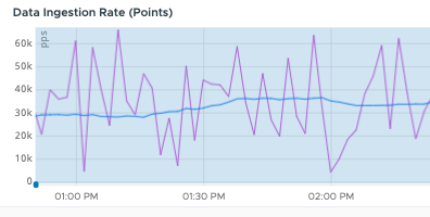
Billing for Operations for Applications is based primarily on the ingestion rate. Ingestion is so important because data is ingested again and again. Operations for Applications supports ingestion every second for metrics. Here’s how you can look for ways to optimize and reduce your ingestion rate.
Examine Ingestion with the Namespace Usage Explorer Dashboard
The Operations for Applications Namespace Usage Explorer dashboard can help you pinpoint where data are coming from.
- Log in to your service instance.
- Click Integrations from the toolbar, and click the Operations for Applications Usage integration.
- On the Dashboards tab, click the Operations for Applications Namespace Usage Explorer dashboard.
This dashboard provides not only a current view but also a historical view. Start at the level 1 namespace to identify the top level. Then dive into levels 2 and 3 for finer-grained information to answer these questions:
- How many different namespaces do I have at each level?
- What are my top namespaces?
- Which are the top 10 metric namespaces and trends over time at each level?
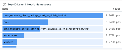
The screenshot below shows an example from our demo server. The data is prefixed with the data source. In the pie chart, you can see that the top namespaces include pcf and kubernetes.
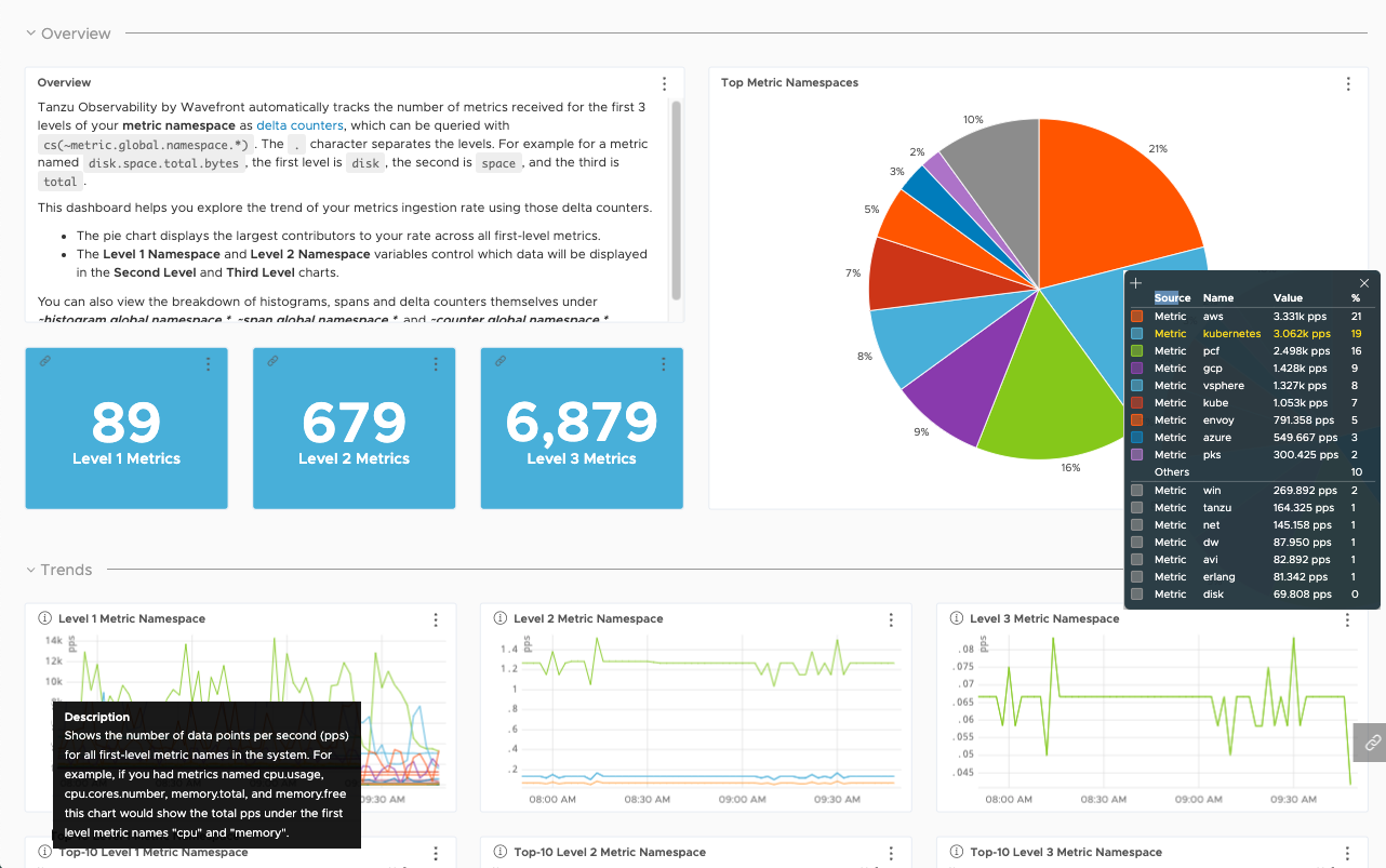
The Namespace Usage Explorer dashboard is especially useful if your metrics use hierarchical name spaces of up to 3 levels that identify who sends which metrics. For example, some of our customers use namespaces that show the Business Unit (Level 1), team (Level 2), and data source. For example, you might have monitoring.dev.kubernetes and monitoring.sales.kubernetes for Kubernetes data coming from the dev and sales teams in the monitoring Business Unit.
(Optional) Clone Namespace Explorer and Create Custom Charts
If you don’t see the information you need, for example if you need a chart that shows histogram ingestion, clone the Namespace Usage Explorer dashboard and modify the existing charts or create custom charts. You can use cs() queries to retrieve information about counters, histograms, and spans. For example, the default dashboard examines ~metric information, but you can also examine counter information using the following format:
cs(~<data_type>.global.namespace.<namespace>.pps, source=<depth_number>)
Here’s an example query that returns the top 10 Level 1 metrics:
rawsum(align(1m, taggify(cs("~metric.global.namespace.*.ppm", source="depth_1"), metric, Name, 3)), Name) / 60
Drill Down with wftopt and Spy API
If you need more than 3 levels of namespaces or if the dashboard doesn’t answer your questions for other reasons, wftop and the Spy API show in detail what’s happening right now.
- wftop lets you examine which ingested metrics were accessed during the last lookback period.
- The Spy API also supports delta counters, histograms, spans, and span logs.
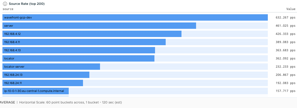
With wftop you can:
- Use the PPS column to examine ingestion rates.
- Use the %Acc. column to examine the percentages of the ingested rates that are accessed by queries.
- Dive into deeper levels of the namespace than with the Namespace Usage Explorer dashboard.
- View ingestion rate by source, point tag, or ingestion source.
- See what percentage of currently ingested data within a namespace is actually accessed in queries over X days. The number of days defaults to 7 and is configurable.
- See what range of values is sent in for a namespace.
- See the data lag for a namespace.
The Spy API gives even more detail, but the information in wftop is usually sufficient.
Consider Sending Data Less Frequently
Even though Operations for Applications supports per second granularity for metric data points, data rarely needs to be that granular.
-
For data that does not need to be that granular, increase the reporting interval for significant savings. For example, switching from a 1-second interval to a 1-minute interval results in a 60x reduction in the ingestion rate for that set of data.
-
Values that do not change often (constants) are great candidates for increasing reporting intervals.
You can use wftop to uncover constant values. The Range column shows the range of the reported values (the maximum value minus the minimum value) for each namespace.
-
If the range is 0, then this data set is most likely reporting constant values.
-
If the range does not change, it is also possible that only a few fixed values are reported. The data set is a candidate for higher reporting intervals.
-
How Can I Optimize My Scan Rate?
Each time a query is executed, the points that the query engine looks at are counted toward your PPS.
- If you examine a dashboard, all queries on the dashboard are executed. What precisely that means for your PPS depends in part on the time window the dashboard uses.
- When an alert is checked, the alert queries are executed.
If you ensure that your environment doesn’t include unused dashboards or alerts, you can significantly improve your scan rate.
Examine the Data Scan Rate with the Operations for Applications Usage Integration
Data points are usually scanned because an alert is checked or a dashboard is displayed or updated. You can get a high-level view in the Operations for Applications Usage integration.
|
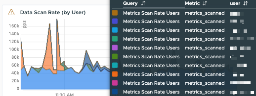 |
More Info
- Monitor Your Service with the Operations for Applications Usage Integration
- Examine Ingestion with the Namespace Usage Explorer Dashboard.
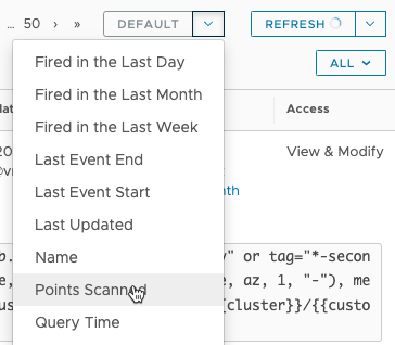
Examine Points Scanned in the Alerts Browser
Even if an alert has no recipients, the alert query is executed at the predefined Alert Checking Frequency (1 minute by default). To significantly reduce the scan rate:
- Delete or snooze all alerts that aren’t being used.
- Examine the alert query (or queries) for alerts with high point rates and optimize query performance with filters and other strategies.
|
 |
Optimize Query Performance
You can significantly reduce the load on the query engine by changing your query. For example, use filters to minimize the search space, include a time window with certain operations, and more.
More Info
Consider Histograms to Improve PPS
Histograms store data as distributions rather than as individual data points. For billing purposes, the rate of distributions ingested is converted to a rate of points ingested through a conversion factor, which is 7 by default.
More Info
See How Histograms Can Improve PPS for an example.
Use the REST API to Compare Ingested and Accessed Metrics
Create a script that uses the Access API category to check how often an entity has been accessed. Supported entities are metrics, histograms, and spans. The default lookback period is 7 days but you can configure it up to 60 days.
Start with metric namespaces that contribute the most to the overall ingestion rate.
- Create a script to determine all of the metric names within those namespaces.
- Feed each of those metric names to the Access API. Focus on specific namespaces one at a time to avoid overload and get actionable information.
Tip: There is an underlying (undocumented) API that the Metrics Browser uses. To take advantage of that API, use your browser’s developer tools to see the underlying API calls.
More Info
Who’s Responsible for Ingested Data?
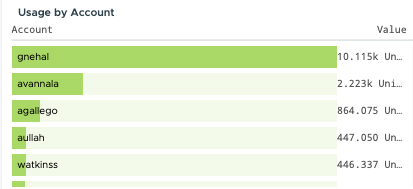
You can find out which teams are using the most data with ingestion policies or from the Namespace Usage Explorer dashboard.
| Action Item | Details | Links & Examples |
|---|---|---|
| Use Ingestion Policies. | Create an ingestion policy for the accounts in each team and monitor the usage per team. | Examine the Service Usage by Ingestion Policy
Operations for Applications Ingestion Policy Explorer Dashboard |
| Examine Ingestion with the Namespace Usage Explorer dashboard. | If many teams in your company use Operations for Applications, it’s good practice to have a policy that includes the team name in each ingested data point. You can then easily determine which teams ingest a lot of data. | Operations for Applications Namespace Usage Explorer Dashboard |
FAQs About PPS
| You want to know... | You can... | For example |
|---|---|---|
| What are the usage trends for my instance? | Use the charts on the Operations for Applications Ingestion Policy Explorer dashboard or the dashboards in the Operations for Applications Usage integration.
Examine your overall usage on the Usage Summary dashboard. |
 |
| Who is responsible for high usage? | Use the Operations for Applications Ingestion Policy Explorer dashboard in the Operations for Applications Usage integration to drill down into accounts and find the accounts responsible for the high ingestion.
Use the Operations for Applications Namespace Usage Explorer dashboard in the Operations for Applications Usage integration to drill down into namespaces and find where the ingested data is coming from. |
  |
| What are current usage details? | Start with the dashboards in the Operations for Applications Usage integration and the Usage Summary dashboard. The dashboards allow you to look at both current usage and usage over time. If you need to drill down more, use the wftop GUI for a detailed view of current spikes. | 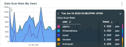 |
| Why do I have cardinality problems? | If you know there's a spike in data (for example, an ID burst), you can use wftop or the Spy utility during the spike to drill down into individual data points and tag values. Those two tools aren't as useful after the spike - use the Operations for Applications Usage integration dashboards instead. | 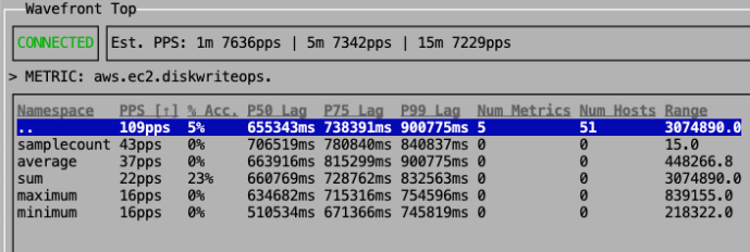 |
| How much data is coming from my source? | You have several options:
Consider creating an ingestion policy for your sources. |
 |