The Wavefront Query Language (WQL) lets you retrieve and display the data that has been ingested into VMware Aria Operations for Applications (formerly known as Tanzu Observability by Wavefront) and create alerts that use this data.
| Time series data | The query language is particularly well suited to manipulating time series data because it accommodates the periodicity, potential irregularity, and streaming nature of that type of data. |
| Histograms | The query language includes functions for manipulating histograms. |
| Traces and spans | Use the tracing UI to query traces and spans. |
Video: Optimize Dashboard Performance
Watch this video to learn how to optimize dashboard and query performance. Note that this video was created in 2021 and some of the information in it might have changed. It also uses the 2021 version of the UI.
Use Performance Statistics
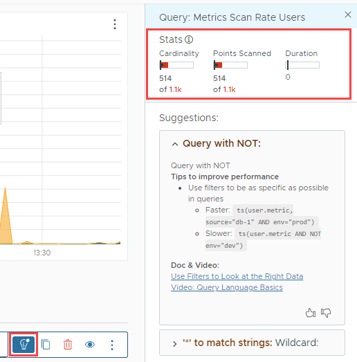
You can see performance statistics for the whole chart and for each query of the chart. For the performance statistics, we measure the following characteristics:
-
Cardinality: Number of unique time series. A unique time series has unique metric name, source name and point tags (key and value). For example, you might receive
networks_bytes_receivedfrom multiple sources and with multiple point tags (e.g.availability_zone). You can lower cardinality for each query (and the chart) by:- Filtering, for example, limiting the query to certain sources, certain availability zones, etc.
- Using ephemeral metrics, which have a shorter retention period.
- Points Scanned: Number of data points that were queried to show the chart on the screen. You can affect this number by including the time window in the query or by changing the time window interactively.
- Duration: Time between query start and return of result.
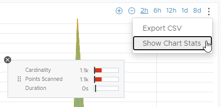
View Chart Statistics
To see the overall performance statistics for a chart:
The chart stats window opens. You can move the chart stats window within the chart borders. |
 |
View Query Statistics
To see the performance statistics for a particular query of a chart or alert:
|
 |
Use Performance Improvement Suggestions
If the query uses certain functions in ways that often cause performance degradation, Operations for Applications shows actionable suggestions for improving the query performance. The suggestions also include links to documentation and videos for details.
| A dot symbol on the lightbulb icon for a query indicates that there are suggestions for improving the query performance. | 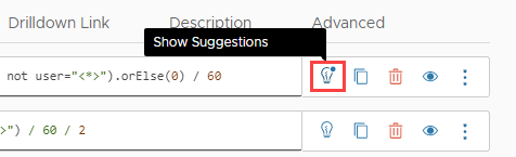 |
To see and, optionally, apply the performance improvement suggestions for a query:
|
 |
Use the Query Analyzer
Sometimes, when you expect to see certain data in Operations for Applications, it doesn’t show up for some reason. By default, in such cases, charts display a No Data message (unless you have overridden this setting and have set up charts to show another message). When you see No Data on a chart, you can use the Query Analyzer to analyze your queries and subqueries. The Query Analyzer helps you identify potential issues, so that you can easily troubleshoot missing data, and also shows performance statistics for the queries and subqueries that result in No Data.
For example, if the query that you want to analyze is max(${latency}), where the latency variable is ts(requests.latency, source="app-1*" or source="app2*", env="dev"), in the Query Analyzer, the query that you’ll see will be: max(ts(requests.latency, source="app-1*" or source="app2*", env="dev")).
Analyze a Query
To use the Query Analyzer and analyze a query and its subqueries:
- Click the name of the chart to open it in Edit mode.
- If you have more queries, locate the query that you want to analyze.
- Click the ellipsis icon next to the query and select Query Analyzer. A new browser tab with the Query Analyzer opens.
- Click Analyze.
The subquery that causes the No Data issue is highlighted.
-
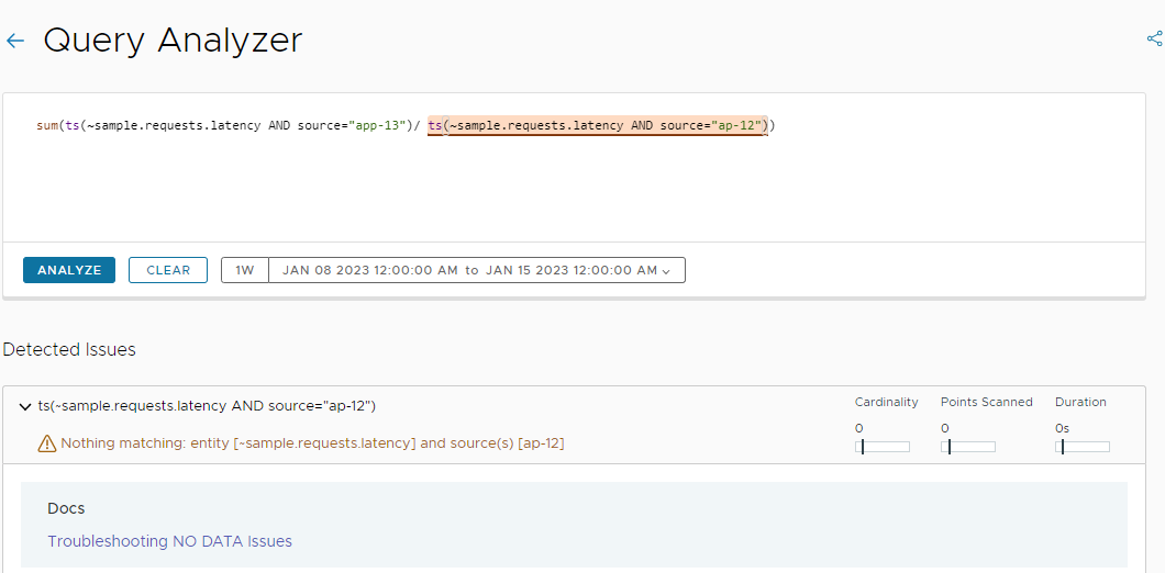
Example 1: The subquery contains a typo.
-
Example 2: No data is present in Operations for Applications.
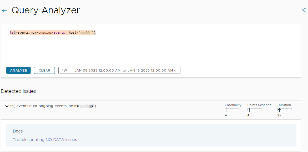
As you can see from the screenshot above, the Query Analyzer also shows performance statistics at a subquery level for the specific time window:
- Cardinality: Number of unique time series.
- Points Scanned: Number of data points that were queried to show the chart on the screen.
- Duration: Time between query start and return of result.
-
Example 3: The query contains more subqueries that result in No Data.
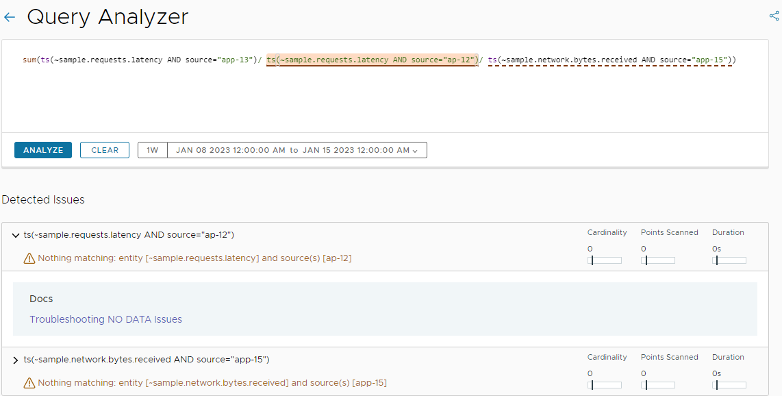
If a query contains more than one subquery that results in No Data, when you analyze the query, the first subquery causing the issue is highlighted and the result for it is displayed under Detected Issues. The other subqueries resulting in No Data are marked with a dotted underline. To expand the result for another subquery, simply click a result under Detected Issues and the subquery will be highlighted.
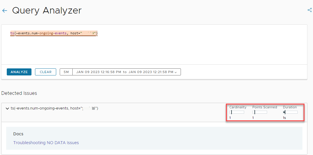
Change the Time Window
By default, the time window used in the Query Analyzer is the time window that you have set for the chart. If you change the time window, the performance statistics update accordingly.
For example, if by default, the time window for the chart is set to one week, the results from the analysis might look like this:
To change the time window:
- In the Query Analyzer, click the time picker.
- Select the new time settings, for example, last 2 hours.
- Click Analyze.
The performance statistics change as shown in the screenshot below.
Share a Link
In addition to investigating and fixing the issues by yourself, you can also share a link to the Query Analyzer with the same problematic query with others from your team.
To share a link to the Query Analyzer:
- On the Query Analyzer browser tab, click the share icon in the top right.
-
In the Share Query Analyzer window, click Copy link.
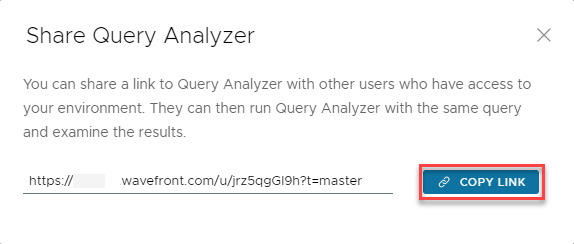
- Send the link to your colleagues who might be interested in examining the results.
Use Filters to Look at the Right Data
For best query language performance, it’s important to look at just the right amount of data.
Use filtering functions in queries narrow down the query space. For example, if a query filters metrics by source or point tag, the query returns faster because the query engine knows which metrics to fetch. Here are some tips:
-
Filter by source: By default, if you query a metric such as
cpu.loadavg.1m, the query engine retrieves that metric for any source (host, container, etc.). To significantly improve query performance, query only for sources that you need to know about.Example:
- Faster:
ts(~cpu.loadavg.1m, source="db-1")narrows down the query to a specific time series. - Slower:
ts(~cpu.loadavg.1m)returns all time series and is slower.
- Faster:
-
Filter by point tag: If your data comes in with point tags, such as the availability zone, environment, or other attribute, you can change your query to filter by point tag.
Example:
ts(~cpu.loadavg.1m AND source=app-* AND env="production")returns only metrics with sources that start withapp-and that also have the valueproductionfor theenvpoint tag.
-
Avoid NOT in filters: With
AND NOT, the query engine has to search through everything matching the metric, and then filter.Example:
- Faster:
ts(~cpu.loadavg.1m, source="db-1" and env="prod")narrows down the query to a specific time series. - Slower:
ts(~cpu.loadavg.1m AND NOT env="dev")is more expensive. WithAND NOTthe query engine has to search through all instances of~cpu.loadavg.1mand extract instances that do not have theenv-"dev"point tag.
- Faster:
-
Filter in the base query: If possible filter in the base query instead of using advanced filtering functions.
Example:
- Faster:
sum(ts(user.metric, source=app-1))) - Slower:
retainSeries(sum(ts(user.metric)), source=app-1))
- Faster:
Be Smart About Aggregation
Aggregation functions like sum() or avg() let you combine different time series, for example, by showing the sum or average of a set of time series. For optimal accuracy, the query engine uses interpolation. After interpolation, each time series has a value at each point in time which improves accuracy during aggregation, but affects performance. See Aggregating Time Series for background and a video.
You have these options to eliminate the overhead from interpolation:
Use align() with Aggregation Functions
The align() function changes how bucketing happens.
Example:
- More precise:
avg(ts(~sample.network.bytes.sent))returns the average over all time series, inserting points so there’s a value for each time series at any time there’s a value for one time series. - Faster:
align(1m, mean, ts("my.metric"))returns the average over all time series, and uses the values at each 1 minute point in time.
In certain cases, the query engine performs prealignment.
Use Raw Aggregation Functions
Instead of using align(), you can avoid the overhead of interpolation with a raw aggregation function. Aggregating Time Series has details and a video.
- Standard aggregation functions (e.g.
sum(),avg(), ormax()) first interpolate the points of the underlying set of series, and then apply the aggregation function to the interpolated series. These functions aggregate multiple series down, usually to a single series. - Raw aggregation functions (e.g.
rawsum(),rawavg()) do not interpolate the underlying series before aggregation.
Example:
- More precise:
sum(ts(~sample.cpu.loadavg.1m, source=app-1*))performs interpolation first, and then computes the sum. - Faster:
rawsum(ts(~sample.cpu.loadavg.1m, source=app-1*))does not perform interpolation and computes the sum from the raw data.
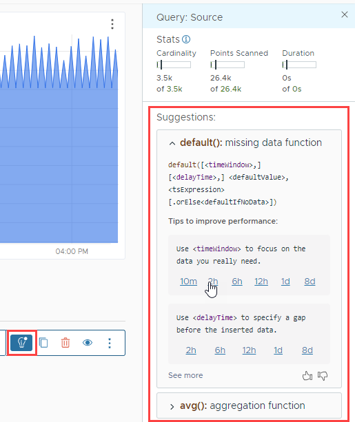
Specify a Time Window with Missing Data Functions
Missing data functions such as last() support an optional timeWindow parameter. The default() function also supports a delayTime parameter. If you don’t specify those time parameters, the query engine applies the default value for every second and for gaps up to 28 days. This impacts performance of the query and the dashboard.
- Faster:
default([<timeWindow>,] [<delayTime>,] <defaultValue>, <tsExpression>) - Slower:
default(0, <tsExpression>)
The time window is a measure of time expressed as an integer number of units. The default unit is minutes. You can specify:
- Seconds, minutes, hours, days, or weeks (1s, 1m, 1h, 1d, 1w). For example, 3h specifies 3 hours.
- Time relative to the window length of the chart you are currently looking at (1vw). If you are looking at a 30-minute window, 1vw is one view-window length, and therefore equivalent to 30m.
- Time relative to the bucket size of the chart (1bw). The query engine calculates bucket size based on the view window length and screen resolution. You can see bucket size at the bottom left of each chart.
Use Wildcard Characters with Care
WQL supports the asterisk (*) as a wildcard character. Wildcards in queries can result in many time series on a chart, which can be confusing and affect performance. If using a wildcard character makes sense for your use case, use delimiters, and don’t use a wildcard at the beginning of a query. Wildcards in source and metric names result in a very large search space and affect performance. For example, if you include a wildcard character in a source name, the system scans all of your sources first.
- Faster:
ts(‘abc.*.xyz’)– Using delimiters around wildcards. - Slower:
ts(“abc*xyz”)– Not using a period as a delimiter. - Slower:
ts("*abc.xyz")– Wildcard character at the beginning of a query.