Data shape refers to how each component of a time series is designed and formatted. Your data shapes in VMware Aria Operations for Applications (formerly known as Tanzu Observability by Wavefront) are important regardless of how you use the service and where you are in your work with the platform.
- New users who plan on sending data into Operations for Applications need to understand the most efficient ways of sending data in.
- Existing users who explore data in dashboards and chart can investigate data shape and use that information to optimize data exploration. If they see that the data shape is not optimal, they might even request changes to how data are ingested.
In this doc page, we:
- Discuss how all users can examine data that are already being ingested.
- Look at best practices for users who send data to Operations for Applications so they can use the optimal data shape and cardinality, and, as a result, optimize performance.
Video
In the following video, Wavefront co-founder Clement Pang explains cardinality and data shape. You can also watch the video here  . Note that this video was created in 2020 and some of the information in it might have changed.
Examine Ingested Data: Lag, Backfill, and Metric Type
If data are already flowing into Operations for Applications, some aspects of how data are being ingested can significantly change what you see in your chart and whether your alerts work correctly. You can often fix problems using missing data function or using the correct metric type.
Ask yourself these questions:
- What is the reporting interval of your metrics, and does it change?
- Is there a lag in your metrics reporting?
- Are the metrics backfilling?
- Are your metrics gauges, counters, or another metric type?
Step 1: Set Up a Chart for Examining Your Data
While the default 2-hour line chart is a great view of recently received metrics that view does not clearly show the underlying live behavior of your metrics.
To examine reporting, lag, and backfill:
- Change the chart type to Point Plot
- Change the time window to 10 minute and use a Live view.
In a Point Plot, each point that you see is a metric in its raw form, as it was received. In a 10-minute window, your points are usually separate enough so that you can identify the different times they were reported at on the x-axis.
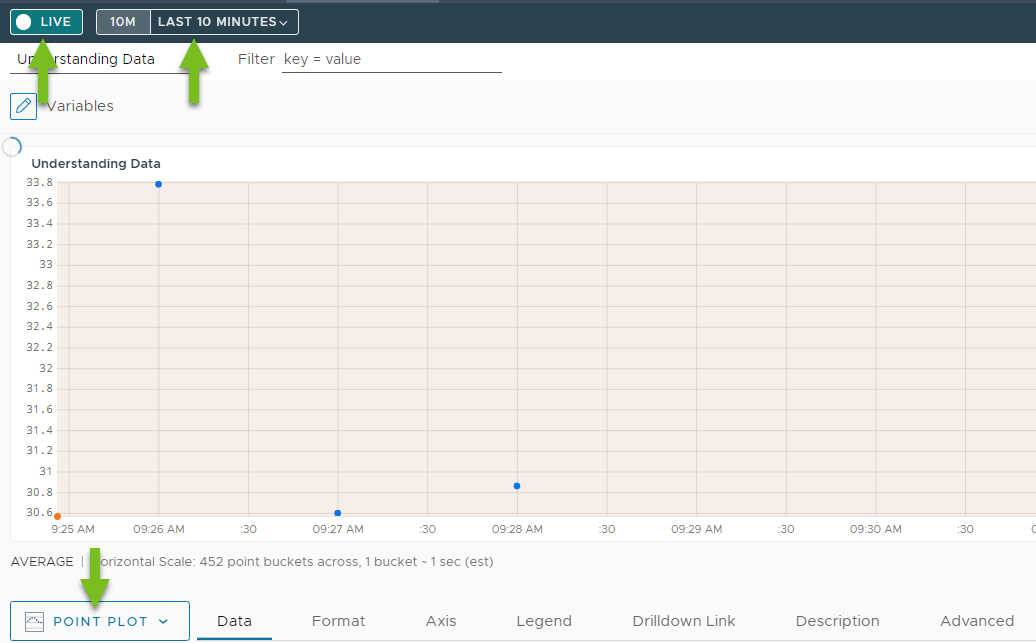
Step 2: Check the Reporting Interval
The reporting interval is the gap between the reported metrics. Knowing the reporting interval helps you determine if you need a missing data function to create visualizations and alerts that work well.
The reporting window is easy to see in your Point Plot with 10-minute time window.
- Hover over each point to determine the time and the associated gap between the metrics.
- Look at the metric without advanced functions applied to the query (if possible) For example, if your query is
align(5m, sum(ts("my.metric"))), use justts("my.metric").
In most use cases and by default, Operations for Applications expects that a metric comes in each minute – your reporting interval is 60 seconds. In the point plot, the points are 1 minute apart. In some cases metrics are separated by more than a minute and the 10 min live view of point plot reflects that.
Here are the common reporting interval scenarios:
- Metrics are reported once a minute.
- Metrics are reported more than once in a minute.
- Metrics are reported at an interval of X minutes where X is more than 1 ( i.e 5 minutes).
- The reporting interval is not constant.
Step 3: Check for Lags in Metrics Reporting
Sometimes data come in with a lag, for example, the data source batches data, there are network connectivity issues. Data lags can result in confusing charts and lead to misfiring alerts. Missing data function can help, but first you have to know if there’s a problem.
In your 10-minute live view, observe the right part of the chart. As the time window slides forward, a new metric comes in once a minute if your metrics have a 1 minute reporting interval. In some cases, there are gaps because of a lag.
For example, let’s examine the following chart:
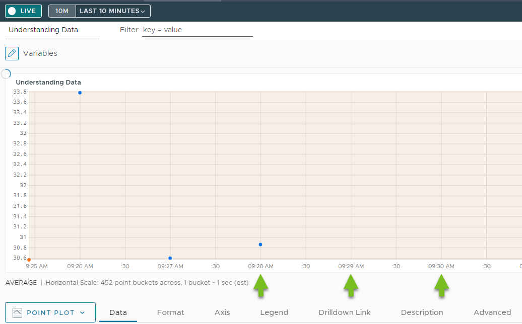
The gap between the points is 1 minute but we don’t see the most recent metrics. This means that there is a lag. See:
- Alerting on Missing Data
- Missing Data Functions. Click each function name for a reference page with examples.
Step 4: Check if Metrics Are Backfilling
Let’s say there is a lag in your metrics coming. When you notice that, check what happens when the metrics do come in. Do they report for up to the current minute or are they backfilled up to a certain time?
For example, suppose there is a delay of about 10 minutes. When the metrics finally show up on the test chart, they only come in for the first 5 minutes of that lag. In this scenario, your live metrics at the current minute are still missing.
Backfilling is slightly different from just having a lag, but you can address the problem the same way. See:
- Alerting on Missing Data
- Missing Data Functions. Click each function name for a reference page with examples.
Step 5: Check if Metrics are Gauges, Counters, or Delta Counters
After considering the reporting interval and any potential delays in the metrics, the other aspect of determining the data shape is to understand what the metric values represent. For time series metrics, we have several options.
-
Gauge: A gauge is a metric where the value represents an actual value of the measurement such as memory used at a certain time or the CPU utilization at a specific time. The key to note with gauges is that the value can go up and down and usually is within a range.
-
Counter: In a cumulative counter metric the values add up. The value either increases or stays the same. A counter reset means that the value dropped to 0, but then the value increases or stays the same again. For example, if you measure system up time in minutes, the value increases until there is a system restart (counter reset).
With counter metrics, it is often useful to use functions such as
rate(),ratediff()ormdiff()because those functions calculate the change over time. -
Delta Counter: Delta counters are different from traditional counters. The delta counter value represents the change in value over time. In Operations for Applications, delta counters bin to a minute timestamp and write operations to the same bin are treated as deltas. Delta counters are helpful for calculating bursts of events because collisions can result if a traditional gauge or counter metrics tries to represent something that changes so rapidly.
See Cumulative Counters and Delta Counters for background
Fine-Tune How Data Are Ingested
If you’re responsible for sending data into Operations for Applications, you can significantly improve performance and get the results you need by following the best practices in this section.
Step 1: Ensure You Send Time Series Data
Operations for Applications supports time series data. Time series track behavior over time. Each data point is a measurement at a particular point in time. We can connect and graph data points because they measure the same behavior at different moments in time. For example, you can measure the CPU load for one data source over time and can then graph those data to show increase, decrease, etc.
Check if your data is time series data. If your data is tracking very unique behavior and the metric/source combination is unique for each data point, it’s difficult to graph that time series.
-
Ensure that none of the components of a data point is so unique that each data point is its own time series.
For example, you might receive
networks_bytes_receivedfrom multiple sources and with multiple point tags (e.g.availability_zoneorenv). For each point tag you add to your data set, you get a new time series. That’s very helpful for informative charts.In contrast, if you include the current time as a point tag, each point has a unique time series. That isn’t necessary (time is already part of the metric) and very inefficient.
-
Ensure that you have a true time series – maybe using Distributed Tracing. If your data is tracking unique behavior where no two data points (or very few of them) belong to the same time series, it’s difficult to graph that time series.
To detect if data is tracking unique behavior (and is not a time series), query the raw data on a line chart. If you see dots rather than lines, you know that each data point belongs to a different series (shown as a dot) and that you do not have true time series data.
Step 2: Minimize the Number of Time Series
Don’t create more time series than necessary. Each time series has unique metric name, source name and point tags (key and value), so if you encapsulate information on your data as point tag, you create additional time series. See Don’t Use Unique Attributes as Point Tags.
Fewer time series means faster data retrieval, so reducing the number of series can pay off. Data that belong to the same series are stored together. Increasing the number of time series slows down data retrieval because:
- More time series need to be scanned to find all the time series that have to be retrieved.
- More time series have to be retrieved. Each dot represents a time series, and if a different query would result in a different set of dots representing time series, all those time series have to be scanned.
Step 3: Be Smart about Data Point Components
Operations for Applications uses several indexes for retrieving data.
- One index uses the metric name and source name combination.
- Another index allows retrieval of data based on the point tag key and values combination.
If you are smart about data shaping to optimize how Operations for Applications uses these indexes so that the query engine can return results faster. See Ask How Data Will Be Queried and Optimize.
Operations for Applications identifies data points that measure the same behavior by looking at the components of each data point (metric name, source name, and point tag name/value). The unique combination of these components describes what a time series is.
For example, Operations for Applications sees that the CPU load for source-1 is different from the CPU load for source-2 and shows 2 time series in the chart. Operations for Applications can also access point tags to display different Kubernetes pods as different time series or to show different time series for different availability zones. See Fine Tune Queries with Point Tags to understand how point tags work.
Step 4: Investigate Lags, Backfills, and Metric Type
As you’re optimizing the data ingestion flow, check frequently how your decisions affect performance. Lags and backfills affect how data is shown in dashboards and charts and can make alerts misfire. Using the wrong metric type can prevent you from getting useful results. See Examine Ingested Data: Lag, Backfill, and Metric Type for best practices (including screenshots).
Step 5: Ask How Data Will Be Queried and Optimize
To optimize the data shape, ask these questions:
- How will the data be ingested?
- How it will the data be queried?
The answers determine what the components of the data points should be. Components include:
- metric name
- source name
- (optional) point tags.
To optimize for the most frequent/common situation, let’s start with source name and metric name. One of the indexes uses the combination of these two.
Pick the Optimal Source Name
Each data point has a timestamp, source, and value. The source name doesn’t have to be the physical host where the data originates.
Ask these questions:
- How the metric will be queried?
- What will be the main (or most frequently used) dimension for filtering or grouping the data? This dimension is often the best candidate to use as the source name.
If you ask these questions, you’ll make good use of the metric name/source name index and you’ll improve the retrieval speed of the data we care about (and query performance).
Example: Set the optimal source name
Suppose you have an application with multiple services and I want to have a time series metric that tracks the request count.
-
Efficient data shape. Suppose that most of the time you want to see request counts by service, that is, you need the request count for each of your services. In that case it makes sense to set the service name as the source name of each data point as part of preprocessing. In your queries, you can then easily see data for each of your services by using the service name as the source filter.
-
Wasteful data shape. Suppose, instead, that you use the host name of the server that is collecting the request count data as the source name. If you do that, you need to add a point tag to specify the service. When you run queries to find request counts for a particular service, you have to filter by point tag. This approach has two problems:
- The source name information (hostname) is not useful.
- The metric name/source name index is not sufficient to retrieve the data you’re interested in and the query engine has to scan more data to find the information you need. A better solution is to design the data shape to make the most efficient use of all components.
Pick Efficient Metric Names
Carefully thinking about the metric name is also important. Look at our ~sample data for some metric names like ~sample.network.bytes.sent or ~sample.network.bytes.rcvd.
- It’s helpful if the metric name reflects data that is comparable across different sources.
- It’s important that the metric name is not too broad and that it shards the data in a way that makes sense.
Example: Decide on efficient metric names
Suppose you have a metric that is tracking response code counts. You want to compare how many responses each service had. In most situations, you want to compare specific sets of response codes. For instance, you may want to compare just the error response codes.
-
Wasteful data shape: If you name a metric
response_code, then you have to use a point tag to track the individual response codes (i.e. 202, 400, 401, 500, etc). Because you actually want to compare counts of a specific response code across services, queries have to filter by metric name, by source name, and by point tag. That’s not an efficient use of the metric name/source name index.Because the metric name itself is too broad, this index doesn’t allow you to directly retrieve the data that you’re interested in. Additional filtering is needed.
-
Efficient data shape: Suppose, instead, that the metric name is
response_code.<code>(e.g.response_code.202,response_code.400, etc.). You can still compare how often you see each response code for each service (source), but you’re using the metric name/source name index more efficiently. You can now directly retrieve the data of interest without needing further filtering.
In most cases, additional filtering is required in your queries. But it’s useful to start out with an efficient metric instead of using a wasteful data shape.
Don’t Use Unique Attributes as Point Tags
Often, the first instinct is to store every attribute in a set of data as a separate point tag key and value. However, it’s important to consider how frequently the values of the point tags change.
- If the value changes rarely it makes sense to use a point tag. For example, assume point tag
azcan have values"us-west-1"and"us-west-2". Many (or all!) data points will have one or the other value forazand filtering by availability zone makes sense.. - If the value changes with each data point, the result is a very large number of time series, each with just a single data point. Having many time series is not efficient and the information isn’t useful. For example, if you want to use a timestamp or other unique identifier, each data point has a different unique value. This slows down data retrieval and therefore, query performance.
The same concept applies to metric names and source names. None of the components of a data point that describe what is being measured should be so unique that each data point is its own time series. Therefore, things like timestamps or unique IDs should not be used in metric names, source names, or point tags.
There are valid situations where it’s appropriate to capture ephemeral information with point tags. But if possible, avoid using unique values in metric names, source names, or point tags.
Learn More!
- For query limits and similar information, see Limits and Best Practices.
- For an introduction to data cardinality that includes a video, see High Cardinality Data