These release notes give an overview of the changes for Release 2020-42.x of the VMware Aria Operations for Applications (previously known as Tanzu Observability by Wavefront) service.
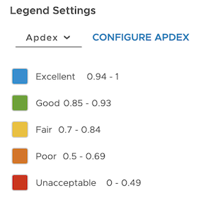
Apdex Score for Services
Wavefront Distributed Tracing now includes Apdex.
The apdex score helps you understand how the response time of a service compares to the predefined response time threshold (T). Using Wavefront, you can:
|
 |
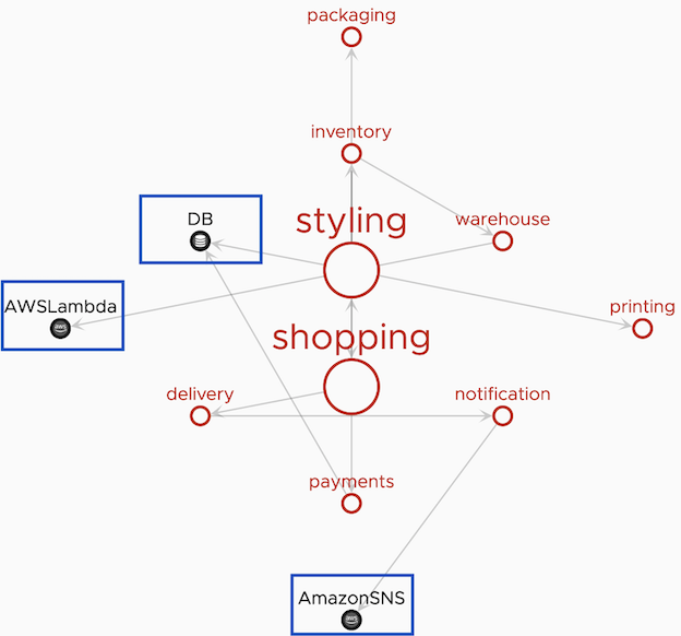
AWS and Database Services in Application Map
The application map that’s part of Distributed Tracing now displays AWS and database services using distinct icons.
| Wavefront can identify out-of-the-box Java AWS services and Java databases in the application map view. Configure Out-of-the-Box AWS and Database Services explains how to configure your OpenTracing, OpenTelemetry, or Spring Cloud Sleuth application to identify out-of-the-box external services or applications that your service communicates with. |
 |
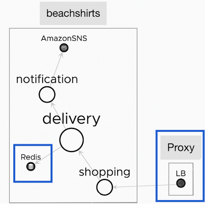
Custom External Services in Application Map
In the application map that’s part of Distributed Tracing, you can now configure external services such as Redis or Ngnix to show up with a custom icon.
| In addition to the out-of-the-box Java AWS and database service, Wavefront can identify your external applications or services. See Configure Custom External Services |
 |
New Dashboards for Usage Monitoring
We’ve added 2 new dashboards to the Wavefront Usage integration.
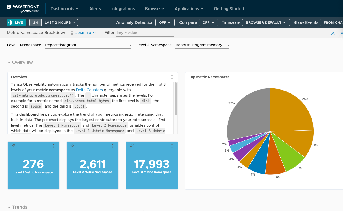
Wavefront Namespace Usage Explorer
Tanzu Observability by Wavefront automatically tracks the number of metrics received for the first 3 levels of your metric namespace as delta counters, which can be queried with cs(~metric.global.namespace.*). The . character separates the levels. For example for a metric named disk.space.total.bytes, the first level is disk, the second is space, and the third is total.
The Wavefront Metrics Breakdown dashboard helps you explore the trend of your metrics ingestion rate using those delta counters.
- The pie chart displays the largest contributors to your rate across all first-level metrics.
- The View Under 2nd Level and View Under 3rd Level variables control which data will be displayed in the Second Level and Third Level charts.
If your environment uses histograms, spans, or delta counters you can view the breakdown of those data under ~histogram.global.namespace.*, ~span.global.namespace.*, and ~counter.global.namespace.*
Committed Rate and Monthy Usage (PPS P95) Dashboard
This dashboard helps you avoid exceeding the committed rate for your instance by exploring dashboards and creating alerts. The charts in the dashboard have a focus on showing where usage exceeds 95% of the committed rate.
Miscellaneous Improvements
- The derived metrics feature now supports both time series metrics and histograms.
- The filter() function now supports the use of source tag filters.
- You can now Zoom into a region of a histogram chart.
1. Select a region to zoom in. 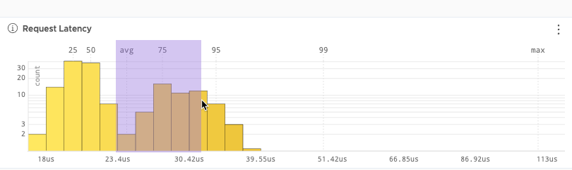
|
2. Click Reset to return to the default.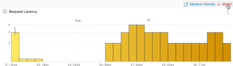 |
Doc Updates
- Video about Browsing Your Data from the Metrics Browser or the Source Browser.
- Video about Cumulative Counters and Delta Counters